How to Bake The Perfect Brand (And what your logo really says about you)
If we are being completely honest, I have totally been avoiding writing this post. I have been struggling - you ask a cook how to cook and they couldn’t just tell you where to start. Not because they don’t know how to cook, but because they have so much knowledge they want to pass on. This, my friend, is definitely my kitchen. I have come prepared with a dish I think you are going to like, just sit back and enjoy the process.
You will need some ingredients:
1 Cup Passion
1 ½ Cup Authenticity
¾ Cup Goodwill
¾ Cup Drive
2 Cheerleaders
1 t Simplicity
1 t Joy
1 t Kindness
1 t Ideas
¼ Cup Positivity
2 Cups Hard Work
1-12oz Bag of Dreams
(Recipe adapted from my late grandmother’s favorite chocolate chip cookie recipe)
To prepare:
Heat up your ideas, take action and mix it up with passion and hard work, then add a dash of persistence.
You see the perfect brand is much closer than you realize, you just have to sit back and utilize all those tools you have at home.
What practical knowledge can you use right now to see how you are currently stacking up? Could you be the next master chef?
Let’s do a little kitchen challenge.
Pull up your current logo. Print it out. Clear your desk and only have this one thing in front of you. What 5 ingredients (words/feelings/qualities) make up your current logo?
Write those down on the left side of your logo.
Now, on the right, list the top 5 ingredients (words/feelings/qualities) your ideal client or customer is looking for?
Is there a discrepancy? Is your logo saying one thing, but your ideal client is off craving something someone else is dishing up?
What if you could change your brand to align more with your ideal client’s tastes?
There is a solution and it has a LOT to do with psychology.
The Ingredients
Listing all the ingredients that make up a brand can be tricky. So let’s stay focused on just your logo. The main ingredient is always the font or fonts it is comprised of.

Stable. Objective. Clean. Modern. Professional. Universal.
5 Examples: Helvetica, Verdana, Arial, Century Gothic and Calibri

Traditional. Respectable. Established. Reliable. Comfort. Authority. Grandeur.
5 Examples: Times New Roman, Bodini, Georgia, Garamond and Baskerville.

Elegant. Creative. Feminine. Friendly.
5 Examples: Lobster, Zapfino, Pacifico, Lucida and Brush Script

Strong. Progressive. Stylish. Chic. Exclusive. Smart.
5 Examples: Infinity, Eurostyle, Majoram, Matchbook, and Politica

Friendly. Unique. Silly. Unconventional.
5 Examples: Bigfish, Disco, Abilene, Alphabet Soup, and Bleeding Cowboys
What category does your logo font fall into? Write these words down on the top of your logo.
Following Directions
When you bake, not following “directions” can lead to bread that won’t rise, cupcakes as hard as a rock and brownies even your dog won’t try to eat. However, some rules need broken every now and again.
For a brand or specifically a logo, the color or colors it makes up can have immediate psychological effects for the viewer. This is such an innate human reaction, however, often what happens instead is the colors of the logo are picked based on taste alone. The gut social reaction is often forgotten. Some things to consider:
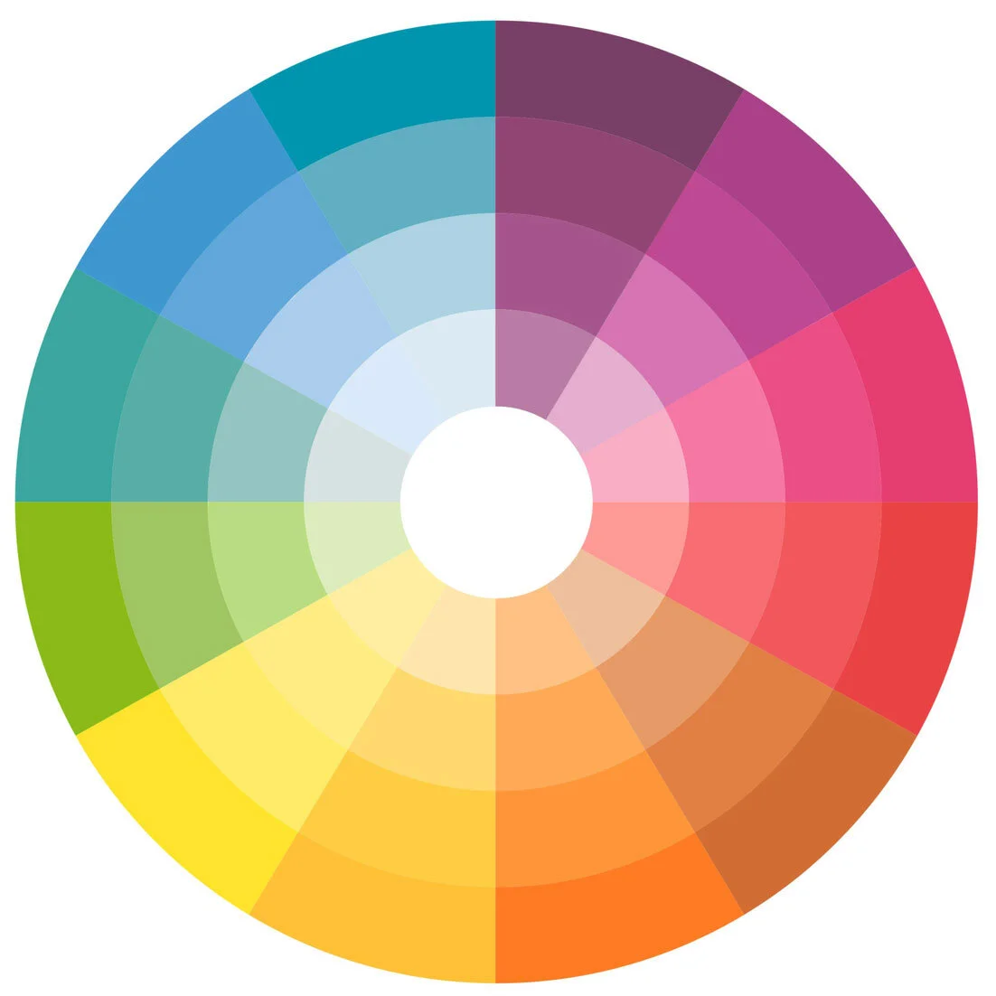
Yellow
Increases Fun, Humor, Lightness, Personal Power, Optimism, Cheer, Intellect, Logic and Creativity. In design it can often grab attention in both an energetic and comforting way.
Gold
Signifies Wealth, Success, Wisdom, and Status. It tends to come in and out of style, but is always classic and timeless.
Orange
Stimulates Creativity, Productivity, Pleasure, Optimism, Enthusiasm, and Emotional Expression. Orange is great for a call to action to buy or subscribe to a product.
Red
Increases Physical Energy, Vitality, Stamina, Grounding, Spontaneity, Stability and Passion. Can come across as Daring, Urgent or Demanding. It can increase a person’s heart rate and make them excited.
Pink
Signifies Romance, Compassion, Faithfulness, Beauty, Love, Sensitivity and Youth. Too much pink can segment out people who would otherwise be interested in what you have to offer. People tend to love it or hate it.
Violet
Stimulates Intuition, Imagination, Universal Flow, Meditation and Artistic Qualities. Incorporate violet or purple to make a design look more luxurious and wealthy or a lighter purple to show romance and mystery.
Blue
Increases Calmness, Peace, Love, Honesty, Credibility, Confidence, Kindness, Truth, Emotional Depth and Devotion. Dark blues can feel professional, but often cold or disengaged. Light blues are more relaxing and friendly – there is a reason Twitter and Facebook are both blue.
Green
Supports Balance, Harmony, Love, Healing, Growth, Communication, Nature and Acceptance. It is a great color to use if a company wants to depict growth, security or inspire possibility.
Black
Signifies Sophistication, Power, Formality and Mystery. Can come across as Dark and Unnatural. The context and the amount can greatly effect the overall feeling.
Gray
Stimulates Balance, Stability, Security, Strength, Character, Authority and Maturity.
White
Offers Freshness, Hope, Goodness, Light, Purity, Simplicity and Coolness.
What key takeaways do you see for your brand? Write them below your logo.
Plating & Presentation
Any good chef knows even if you use quality ingredients, and follow all the directions you can still turn away people from looks alone. The plating and presentation is key. How do you garnish it? In what context do people see it?
The same holds true for your brand. How do people interact with it online? Is it something you are proud of? Are you showcasing all you have to offer, or is it barely still recognizable?
I want you to go back to the beginning. Do those 5 ingredients you wrote on the left match the right? Do the ingredients you are actually using on the top match what you thought you had or what your ideal client wants? By following the directions are you communicating what you thought you were? Is the context in which your brand is seen and used complimentary or does it take away?
Let me know. I want to see how you stacked up to this little bakeoff. Comment below.
More Great Tools for Your Brand
Not sure if your brand stacks up? Constantly comparing your marketing tools to other, larger brands? At The Creative Template Shop, we have Canva templates for tons of different purposes. Give your brand a facelift!